
CaptureDeck lets you automate and schedule screenshots. If you haven't checked it out yet, click here to sign up.
We've added a comparison tab to CaptureDeck that makes it simple to spot differences between consecutive captures of your web pages.
Slider View lets you slide left and right between your current and previous captures. This is perfect when you want to see the overall before/after:
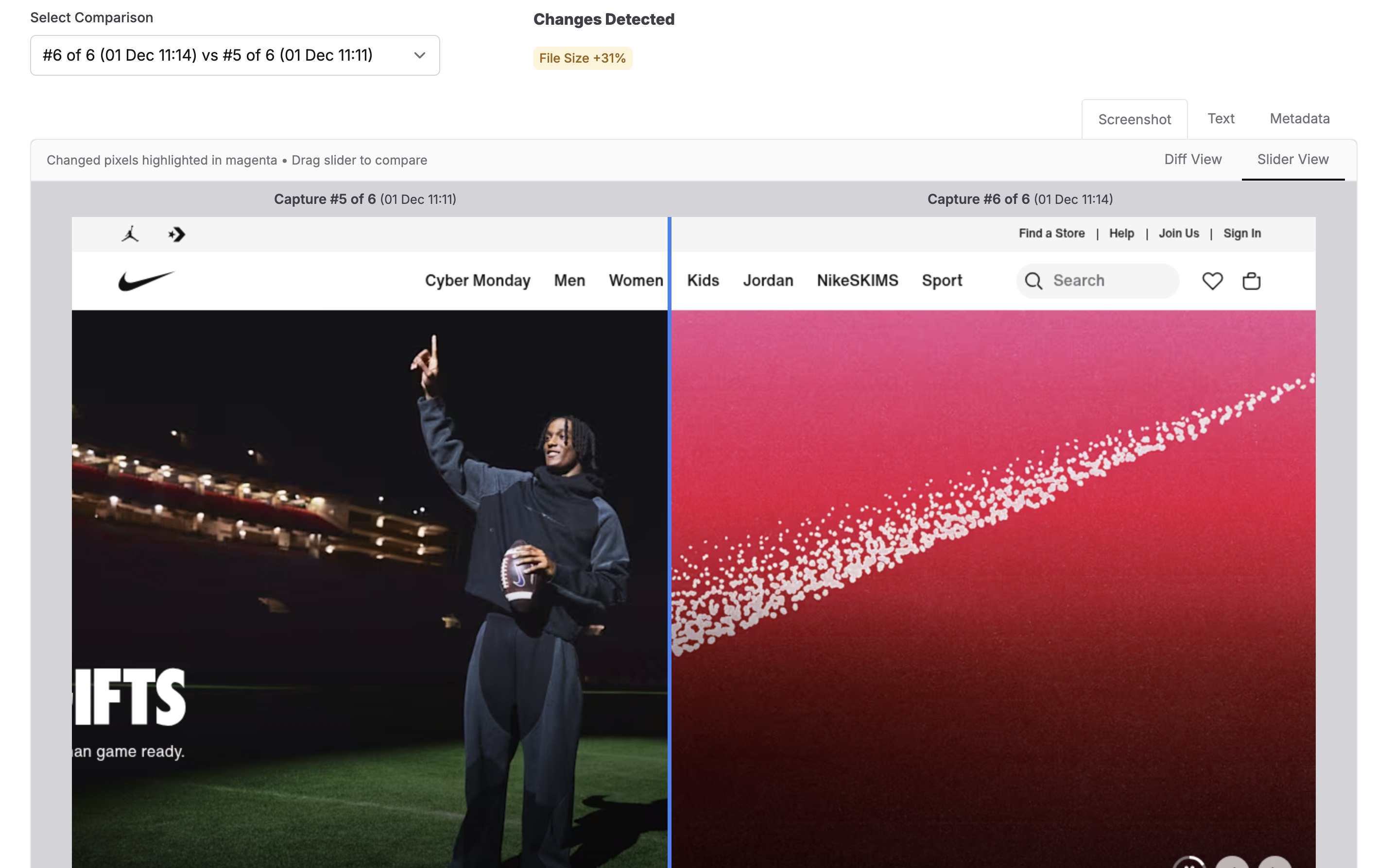
A great way to test this out is to choose a site that you know A/B tests or has moving banners.
Diff View highlights exactly what changed, marking the differences from your last capture in magenta. This makes it easy to spot text updates, moved elements, a completely different height screenshot, or subtle changes:

We've already found these quite useful for ourselves, testing out different presets and different webpages to see how much they differ from capture to capture. Getting image comparison right was surprisingly tricky, and it probably needs continual refinement to get it just right for everyone's use cases. Below I do a bit of a deep dive into the different image comparison methods and why we settled on one called SSIM.
Deep Dive: Implementing SSIM in Ruby
I had only ever consumed packages that other developers have made in the realm of image diffing (IE Pixelmatch). Usually doing a simple pixel-by-pixel comparison of brightness is enough, but for this I needed something written in Ruby that compares images more like a human would and less like a computer would. Since there was nothing easily available, I experimented with a few methods, then ended up implementing a version of the SSIM method.
I'm not a maths head at all, I often get simple addition wrong, so I decided to break this down in terms that my GCSE-maths brain circa 2011 can just about cope with.
The Use Case
As a user I want to know about changes that are actually material, like changed content. I don't want to be told that there's a 100% change between two screenshots just because a cookie banner with a slightly darker overlay is present. I also don't want to be told there's a change if the devs at the webpage I'm screenshotting decide that their background shouldn't be #FFFFF, but #FFFFE instead.
Notable changes I adopted for this were changes like 'new landing page refresh' or 'new sales tactics' or 'new line of products out', where content on a page is actually new.
Here's an example of a simple pixel-wise comparison failing this test:
You can see here that I needed something more tailored. I needed to find something that reduced these false positives but still showed actual content changes. Also, something nerdy enough to be useful, not so nerdy that it becomes incomprehensible.
Most of my inspiration for this pulled from Jeff Kreeftmeijer's Gist on comparing images and creating image diffs.
He discusses using ChunkyPNG and Ruby to implement various diffing methods. Here's a summary of some of the methods he describes:
- Pixel-by-pixel comparison
This is probably the method your flavour of ✨ Agentic AI ✨might spin up without thinking twice. It takes pixels in matching locations, compares them for brightness difference, and from that generates a score. It's good for something quick, and particularly for visual regression tests. It's not so good at a more human-like comparison, as you saw in the screenshot above. It can't tell the difference between slightly darker pixels and completely different coloured pixels (IE it thinks two colours are the same if they have the same brightness).
- Using the Colour Difference Metric (ΔE (Delta E) CIE76 standard).
This is an extension of the pixel by pixel comparison, but instead of calculating using a simple 'is this pixel brighter' comparison, it calculates the difference in colour of each pixel using Euclidean distance in RGB instead. Think about the RGB spectrum placed on the XYZ axis. You take the difference between the R values, the G values, and the B values, then blend those differences into one number that represents “how different is the colour overall”, giving one diff value. This does solve for images that are ever so slightly darker/lighter, as it places it's scoring more on colour than just brightness.
What Is SSIM
I could have used the colour difference metric. However, when I experimented with a few image comparisons such as the one above with cookie banners and darker overlays, the accounting it did for brightness was still too sensitive. It would still think there was a massive difference in images when the content was almost entirely the same. I needed a different angle and found SSIM.
It took me more time than I'm willing to admit to understanding it.
SSIM essentially wants to answer the question 'do these look the same to a person' instead of 'are the pixels in these images the same'. It takes these three qualities:
- Brightness (luminance): It checks whether both images have the same average brightness in a region.
- Contrast: It checks how much the brightness fluctuates inside each region — whether the textures are smooth or sharp/detailed.
- Structure: It measures whether those fluctuations rise and fall in the same pattern/alignment in both images — meaning the shapes and edges line up.
Then, the formula combines the brightness comparison with the “contrast * structure” comparison to produce one similarity score. A perfect match gives 1.0, completely different gets 0.0.
If you look at page 606 of the paper from 2004 when the method was created, you'll see the three formulas that make up the SSIM equation. I actually found the paper useful, but won't pretend I can understand the notation!
What appeals to me about SSIM is that the brightness calculation is less of a key factor in the final score because structure and contrast are accounted for. Here's how it results with my cookie banner comparison, which is actually pretty darn close to what I'd hoped for:

What's great about this comparison is that though the cookie banner itself is still detected as a change, the darker overlay surrounding it isn't seen as a change.
In my implementing this, I opted to use ruby-vips instead of ChunkyPNG. ruby-vips is a wrapper around libvips, written in C. ChunkyPNG is quite rudimentary compared:
- ruby-vips handles more than just PNG's
- It uses an optimised C library designed for this, rather than a single-threaded pure ruby implementation like ChunkyPNG
- It is actively maintained. The last update to ChunkyPNG was in 2021
- You don't have to run loops over pixels in the images, you run operations straight on the image. It's already optimised to do the heavy lifting.
Step 1 - Luminance/Brightness comparison
What this does is a touch different from exact pixel brightness comparison. It checks the average brightness in the local neighbourhood of each pixel. We blur the image first, to get an average brightness. I used a Gaussian Blur, which does pretty much that!
If you've never seen what that looks like:

Here's the code I used to replicate it in Ruby. Converting the pixels to floats first gets a more accurate measurement:
blur_radius = 1.5 # what they used in the SSIM paper page 606.

# Convert to grayscale
image1 = img1.bands > 1 ? img1.colourspace("b-w") : img1
image2 = img2.bands > 1 ? img2.colourspace("b-w") : img2

# Convert to floats
image1 = image1.cast("float")
image2 = image2.cast("float")

# the average brightness in a small local neighborhood around each pixel
# We blur the image slightly to get the "local average" brightness
mean1 = image1.gaussblur(blur_radius)
mean2 = image2.gaussblur(blur_radius)
And just like that, we have our local mean average brightness for each image.
Step 2 - Contrast Match
The next step is to get the contrast score of the images which involves using brightness². I needed to really simplify this down to understand how in tarnation we get contrast from brightness. Here's my best explanation:
If neighbouring pixels in an image have similar values, you'd consider that area smooth. like a nice smooth fading colour gradient. That could be represented as an array of pixels like this:
Region A:
[90, 91, 92, 90, 93]However, if neighbouring pixels have contrasting values, you know you've likely hit an edge of something or a texture or detail change. If you've ever used photoshop to remove the background on an image, you can probably imagine those pixelised edges. The array representation for that could be:
Region B:
[0, 200, 10, 220, 5]To calculate contrast, take the value of the pixels squared, then perform the same gaussian blur from step 1. If you just took the average brightness of these both without squaring them, you'd get 91 and 87, so we would think they're pretty much the same, which is why squaring it is so important.
If you square each of the pixels IE you run 0x0, 200x200, 10x10, 220x220, 5x5 first, it makes those bigger values explode and come out of the woodwork, highlighting variation over just average brightness.
Region A squared:
[8100, 8281, 8464, 8100, 8649]makes a mean average of 8319.
Region B squared:
[0, 40000, 100, 48400, 25]makes a mean average of 17700.
I've used a simple mean in the above example, but SSIM uses a weighted average IE the values above are averaged using a Gaussian blur. The key takeaway is the same, you get an amplified diff, showing you contrast.
So to complete Step 2, we use the grayscale images from Step 1 and the average brightness maps from Step 1 and:
1. Square the original grayscale image first, then blur it
This gives us the Gaussian-weighted average of the squared pixel values — the “local squared brightness.” This is literally step 1 but we square the image pixels first to highlight contrast.
(image1 * image1).gaussblur(blur_radius)
(image2 * image2).gaussblur(blur_radius)
2. Take the average brightness from Step 1 (luminance/brightness) and square that
(mean1 * mean1)
(mean2 * mean2)
3. Subtract the two
The difference between these two steps tells us how much each image varies individually. That variation is SSIM’s measure of contrast.
Here's the code:
variance1 = (image1 * image1).gaussblur(blur_radius) - (mean1 * mean1)
variance2 = (image2 * image2).gaussblur(blur_radius) - (mean2 * mean2)
Step 3 — Structure Match
In Step 1 we got brightness. In Step 2 we got contrast. Now we want to know Do the two images vary in the same way? Or in other words: is the contrast aligned?
You could think of this like two sound waveforms. You’re not asking how loud each one is (contrast), but whether the waves rise and fall together in the same places (structure).
Here's how we do it:
- Multiply corresponding pixels together
(image1 * image2)The first part of the calculation uses pixel-by-pixel multiplication between the images to see whether both images brighten or darken at the same places. Multiplying pixels is a way to detect co-movement:
- Big * big = very big
Both images are bright in that spot → likely the same structure.
- Small * small = small (but still positive)
Both images are dark in that spot → still aligned → structure likely matches.
- Big * small = medium-ish
One image bright, one image dark → not aligned → weak structure match.
The multiplication highlights where the two images are both rising or both falling, and it downplays places where they behave differently.
- Blur that using the same Gaussian window
(image1 * image2).gaussblur(blur_radius)We do this so the result isn't as noisy, just like with our other Gaussian blur steps.
- Subtract the product of the two means (putting it all together).
covariance = (image1 * image2).gaussblur(blur_radius) - (mean1 * mean2)Up to this point, the structure calculation gives false positives in places where we expect no structure at all. Imagine a page with the brightest #FFFFF shade background. The kind that burns your retinas. There's 0 structure there, we humans know that, but this method thinks there's a structure match. So we need to remove that part from the equation, which is what the above does.
mean1 and mean2 from Step 1 give us the average brightness of each neighbourhood in the two images.
These are already-blurred brightness values, so if both images happen to have a bright region, their means will also be bright.
Imagine those means look like this:
Mean of Image 1:
[250, 252, 251, 250, 249 ...]Mean of Image 2:
[248, 251, 252, 249, 251 ...]Multiply those together:
[62_000, 63_252, 63_252, 62_250, 62_499 ...]These are massive numbers, so it tells us that area is expected to be quite bright anyway, and there's really no structure to take interest in. By subtracting these numbers from the structure match up to now, we remove those areas we expect to be bright, and what’s left shows that extra bit of rising and falling we actually care about.
Putting it all together
Now we just need to plug all of these numbers into the final SSIM equation.
We multiply the brightness match by the contrast and structure match, then use a denominator to help generate something stable between 0 (no match) and 1 (exact match).
We use constants to avoid instability when either the brightness map is super dark (near 0) or when there's little variance in contrast and structure. I follow the original SSIM paper's equation for this:
Instability Constant = (Stability factor * 255) squared.
255 is the dynamic range of the pixel values for 8-bit grayscale images. They set the stability factors in the paper, and mention that their somewhat arbitrary, and the performance of SSIM is fairly insensitive to anything different. Have a read of the paper, it's a real bedtime page turner.
Here is the final method:
  LUMINANCE_STABILITY_FACTOR = 0.01
  CONTRAST_STABILITY_FACTOR = 0.03
  LUMINANCE_CONSTANT = (LUMINANCE_STABILITY_FACTOR * 255)**2
  CONTRAST_CONSTANT = (CONTRAST_STABILITY_FACTOR * 255)**2
  BLUR_RADIUS = 1.5

  def ssim_map(img1, img2)
	image1 = img1.bands > 1 ? img1.colourspace("b-w") : img1
	image2 = img2.bands > 1 ? img2.colourspace("b-w") : img2

	image1 = image1.cast("float")
	image2 = image2.cast("float")

	mean1 = image1.gaussblur(BLUR_RADIUS)
	mean2 = image2.gaussblur(BLUR_RADIUS)

	variance1 = (image1 * image1).gaussblur(BLUR_RADIUS) - (mean1 * mean1)
	variance2 = (image2 * image2).gaussblur(BLUR_RADIUS) - (mean2 * mean2)
	covariance = (image1 * image2).gaussblur(BLUR_RADIUS) - (mean1 * mean2)

    numerator = (mean1 * mean2 * 2 + LUMINANCE_CONSTANT) * (covariance * 2 + CONTRAST_CONSTANT)
    denominator = (mean1 * mean1 + mean2 * mean2 + LUMINANCE_CONSTANT) * (variance1 + variance2 + CONTRAST_CONSTANT)

    numerator / denominator
  end
And boom, in 12 lines of code I have something like an SSIM map. Shame this isn't already implemented but it was a fun thought exercise.
SSIM works pretty well for this use case, but one weakness is that you can get false diffs when an image shifts/translates by a pixel or two to the left/right/top/bottom. Complex Wavelet SSIM solves this as it's designed to recognise the same structure even when the image moves slightly.
Another weakness is that though it ignores these pesky darker overlays I've been trying to ignore, it will still think some text in that region has changed. Annoying, but like I said before this will likely be refined as we go on.
Sample Repo
I made something to illustrate the different image comparison methods I tried. You can clone it here and play around with it yourself.
Happy Rendering 📸