In the age of smartphones, ensuring your website looks and functions seamlessly across devices has become increasingly important. A responsive and adaptable design can significantly enhance user experience, leading to better engagement and conversions.
In this article, we'll explore why testing your website on different screen sizes is critical for user experience and provide insights on how to test your site on a diverse range of devices effectively.
What is User Experience (UX)?
User experience (UX) refers to a user's overall experience when interacting with your website. UX encompasses all user interaction aspects, including usability, functionality, design, accessibility, and emotions elicited throughout the process.
The main goal of user experience is to create a seamless, efficient, and enjoyable experience that meets the user's needs and expectations.
A well-designed website can increase user satisfaction and engagement rates, improve customer loyalty, and even boost conversions and revenue.
In contrast, a poor user experience can result in frustration and lower engagement, hurting your business.
What is responsive website testing?
Responsive website testing evaluates and ensures a website works as expected and displays optimally across various devices and screen sizes. As users access websites from multiple devices, including desktops, laptops, tablets, and smartphones, a website must seamlessly adapt to these different environments.
Responsive website testing involves checking the following aspects:
- Layout and design: Ensuring the website's design elements, such as images, text, and navigation, adapt and reposition themselves properly according to the screen size and device orientation.
- Functionality: Verifying that all features and functionalities of the website, including buttons, links, forms, and media playback, work smoothly and consistently across different devices.
- User experience: Assessing the website's overall usability, including readability, navigation, and loading times, ensures users have a positive experience regardless of their browsing device.
Responsive website testing can be performed using various tools and techniques, including device emulators, real device testing, and automated testing tools. A critical aspect of web development is to deliver a consistent and enjoyable user experience, leading to higher user engagement, better conversion rates, and improved overall website performance.
Why you should test your website on different screen sizes and devices
People browse the Internet from various devices such as phones, laptops and desktops, tablets, and even TVs, which means your website should be able to adapt to virtually any screen size, from 5-inch phone screens to 40-inch TVs.
That's why it's important to constantly test how your website loads on different screen sizes and devices. Testing can also help you discover possible bugs before they become significant problems.
Using an AI tool for testing at this stage can significantly streamline how those bugs are identified across breakpoints and devices. Instead of manually inspecting every screen variation, AI can simulate user interactions and flag layout or usability issues proactively. This enables faster iterations and higher confidence before deployment. It’s especially useful for content-heavy or frequently updated sites that require ongoing visual checks.
Making sure your website renders properly will not only provide a great user experience but can also help you rank higher on search engines, boost conversions and sales and help you maintain a professional brand image.
Increase user experience
Testing your website on different screen sizes and devices allows you to identify and fix any design, layout, or functionality issues that may hinder a user's experience.
A well-optimized website provides a smooth, user-friendly experience across all devices, increasing user satisfaction, engagement, and the likelihood of users returning to your site.
Improve SEO
Google has adopted a mobile-first approach, favoring websites optimized for mobile devices in its search rankings. By testing your website on different screen sizes, you can ensure that it is fully responsive and meets Google's standards, leading to increased visibility in search results.
Furthermore, a well-optimized website helps decrease bounce rates, as users are more likely to stay on a site that offers a seamless experience, which can improve your search engine rankings.
Boost conversions and sales
A website optimized for different screen sizes makes it easy for users to navigate and complete desired actions, such as making a purchase or filling out a contact form.
Moreover, displaying information in an easy-to-read manner and ensuring that essential features function smoothly on all devices can directly impact conversions and sales, ultimately increasing your revenue.
Ensure a consistent brand image
Testing your website on various screen sizes and devices helps maintain a consistent brand image across all platforms.
A cohesive design and user experience on every device showcase your brand's professionalism and commitment to quality, reinforcing trust and credibility in the minds of your users.
Consistency also helps build brand recognition, ensuring your website leaves a lasting impression on your audience.
How Testing on Different Screen Sizes Works
Ensuring a positive user experience across various devices requires testing your website on multiple screen sizes. This process helps you identify and address design, layout, or functionality issues affecting usability. Several approaches can be used for this testing, such as device emulation, screenshot-based testing, and real device testing.
Device emulation and testing tools
Device emulation and testing tools enable you to simulate how your website loads and displays on different devices and screen sizes. Not many of these tools allow you to automate the testing process, so you'll have to manually check your website after every update.
These tools can be pricier than other alternatives, but they may work better for complex websites that require more extensive testing to ensure optimal user experience.
Screenshot based testing
Screenshot-based testing helps ensure your website is free of bugs and visual inconsistencies across different devices.
This method lets you keep an archive of your website's appearance, enabling you to track changes and correlate any issues that may arise over time.
In addition, screenshot-based testing is the cheapest and fastest option to implement, as you can set it up and let it run automatically.
One such tool that offers this service is Urlbox, which provides an easy-to-use API for capturing screenshots of your website on various devices.
Real device testing
Real device testing involves testing your website on actual devices, such as smartphones and tablets, to ensure proper functioning and appearance. This method is less preferred due to the need for a wide range of devices and the associated costs.
This type of testing is most suitable for apps built for specific devices or operating systems, such as iPhones or Android phones.
And while you can automate real device testing, it can be expensive and prone to errors due to the physical limitations and varying conditions of the devices being used.
5 Tools for Testing Your Website on Different Screen Sizes
Urlbox - Screenshot Service API
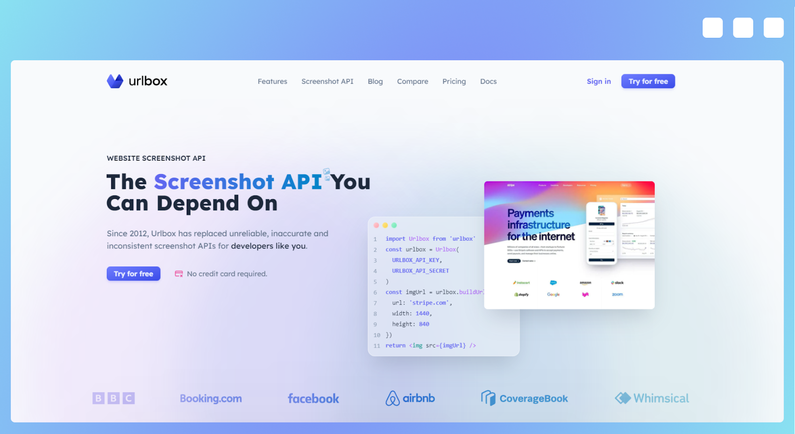
Urlbox is a powerful screenshot service API that allows you to capture full-page screenshots of websites on various devices and viewports. With the ability to emulate various devices based on User Agent and output images in formats such as PDF, JPEG, and PNG, Urlbox offers a versatile solution for website testing and archiving.
The API is compatible with all programming languages and includes a Zapier connector, making it a highly accessible tool for developers and non-developers alike. Try Urlbox today to enhance your website testing process.
Pros
- Blazing fast capture: Urlbox offers rapid screenshot capture, ensuring you can quickly obtain the visual data you need to assess your website's performance across different devices.
- Complete support for any website: Urlbox can capture screenshots of websites with a wide range of design elements, including flexbox layouts and emojis, ensuring accurate representations of your site.
- Seamless integration with Amazon S3: Urlbox can be easily integrated with Amazon S3, allowing for effortless uploading and storage of your captured screenshots.
- Affordable pricing plans: With pricing plans starting at just $19 per month for 2,000 screenshots, Urlbox offers a cost-effective solution for businesses and individuals looking to test their websites on different devices and screen sizes.
Cons
- External storage required: To store the captured screenshots, you will need to set up external storage, such as Amazon S3, which may add an additional layer of complexity and cost to your testing process.
- Manual screenshot review: While Urlbox provides the necessary screenshots, it is up to you to review them and identify any issues or inconsistencies, which can be time-consuming, especially for large websites with numerous pages.
BrowserStack
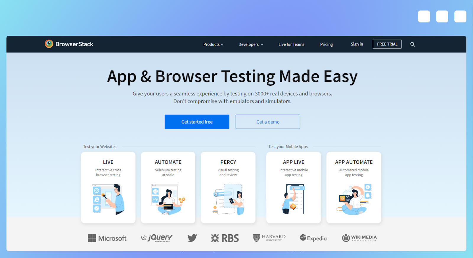
BrowserStack is a powerful cross-browser testing software that enables you to test your website on thousands of devices, ensuring optimal performance across various platforms. This comprehensive tool allows for both manual and automated testing, making it a versatile solution for web developers and QA professionals.
Additionally, BrowserStack supports testing on localhost, staging, and private websites, providing a well-rounded testing environment.
Pros
- Real device cloud: BrowserStack boasts a real device cloud of over 20,000 real iOS and Android devices, ensuring accurate testing results and a genuine user experience for various devices.
- Unlimited testing minutes: All BrowserStack plans come with unlimited testing minutes, allowing you to thoroughly test your website without worrying about running out of time or incurring additional costs.
- Mobile app testing: Besides website testing, BrowserStack also supports mobile app testing, making it a comprehensive solution for both web and app developers.
Cons
- Expensive pricing plans: BrowserStack can be pretty costly, particularly if you require both mobile and desktop functionality. Pricing starts at $39 per month, and if you want to use the automation feature, the cost goes up to $199 per month.
- Complicated setup for website archiving: If you want to create a website archive in addition to testing, the setup process with BrowserStack can be more complex than other testing solutions, which may require additional time and effort.
LambdaTest
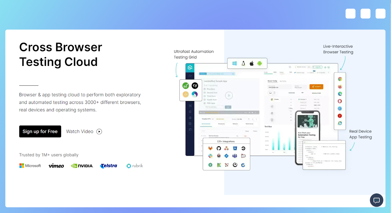
LambdaTest is a comprehensive cross-browser testing software designed with developers in mind, offering testing capabilities on over 3,000 devices and browsers. This robust platform focuses on providing a wide range of testing options and is enhanced by third-party integrations with CI/CD, project management, and codeless automation tools.
The software enables developers to ensure optimal performance and compatibility across numerous devices and browsers.
Pros
- Real-time cross-browser testing: LambdaTest provides real-time cross-browser testing on more than 3,000 environments, allowing developers to validate their websites and applications across various platforms.
- Free plan available: LambdaTest offers a free plan that allows users to test their websites on a limited number of devices and environments, making it an accessible solution for those who are just getting started with cross-browser testing.
- SmartUI Visual Regression: The platform's AI-powered visual regression testing feature, SmartUI, helps developers identify and eliminate visual UI bugs, ensuring a consistent and polished user interface across all devices and browsers.
Cons
- Too many features for small and medium-sized websites: LambdaTest's extensive range of features and capabilities may be overwhelming and unnecessary for small to medium-sized websites that do not require such comprehensive testing.
- Expensive pricing for automation: If you want to automate testing, LambdaTest's pricing starts at $99 per month, which may be prohibitive for some businesses or individual developers on a limited budget.
AWS Device Farm
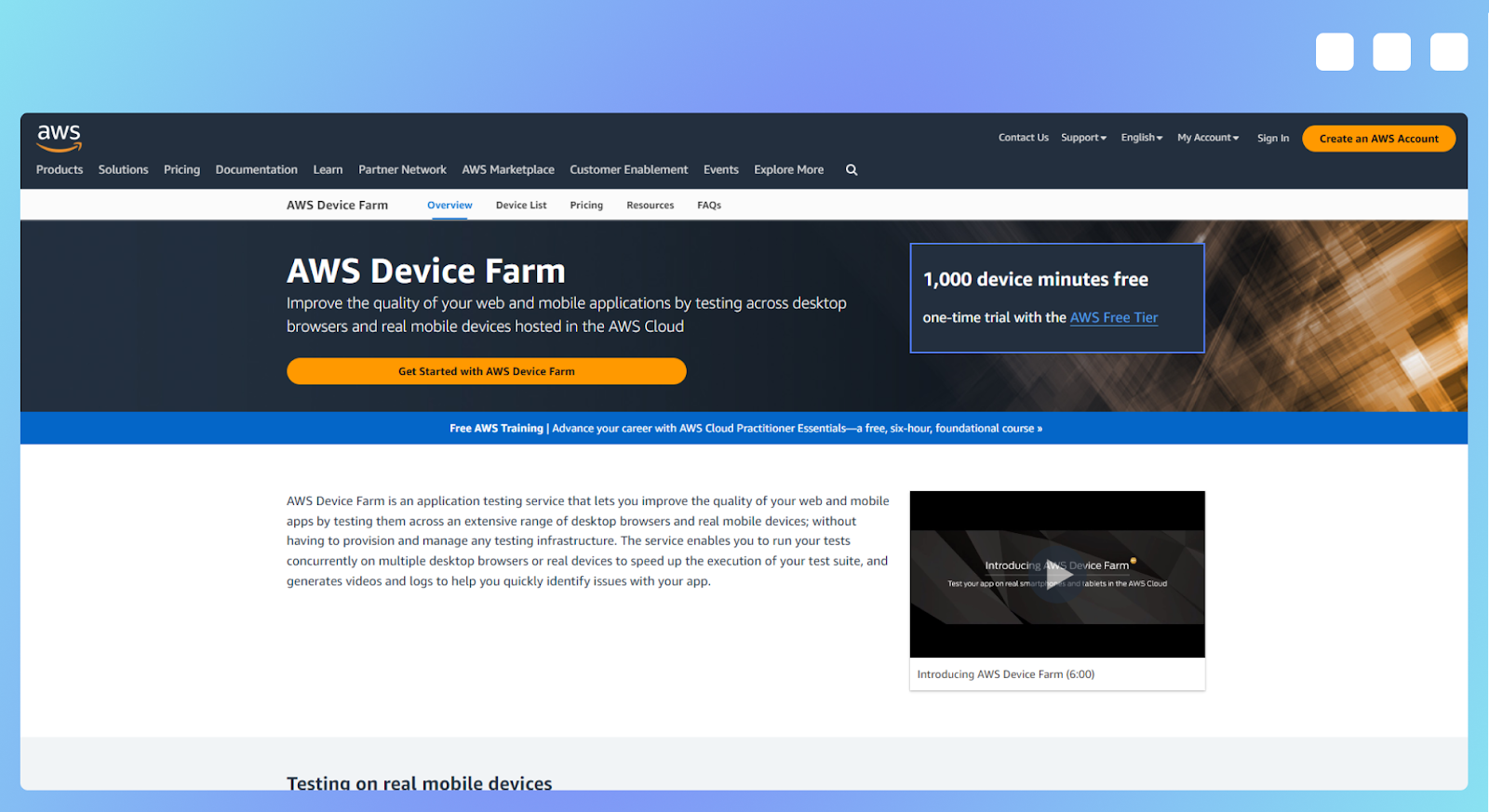
AWS Device Farm is a robust testing platform that allows you to test your websites and applications on thousands of real devices. With this service, you can run your Selenium tests in parallel on multiple versions of Chrome, Internet Explorer, and Firefox – all hosted in the AWS Cloud.
It also provides remote access, enabling you to gesture, swipe, and interact directly with devices in real-time from your web browser.
Pros
- Pay-as-you-go pricing: With a cost of $0.17 per device minute and a one-time free trial of 1,000 device minutes, AWS Device Farm offers a flexible pricing model that can be tailored to your testing needs.
- Simulate real-world environments: AWS Device Farm allows you to test your website or application in various real-world scenarios, ensuring optimal performance and user experience across different conditions.
- Seamless integration with your development workflow: AWS Device Farm offers service plugins and APIs that enable you to automatically initiate tests and retrieve results from IDEs and continuous integration environments like Android Studio and Jenkins.
Cons
- Developer-focused: AWS Device Farm is primarily geared towards developers, which may make it less accessible to non-technical users or those with limited experience in website and app testing.
- Additional setup required for screenshot functionality: To track progress and archive your testing efforts, you'll need to invest extra time and effort in setting up screenshot functionality, as this feature is not built directly into the AWS Device Farm platform.
Chrome Developer Tools
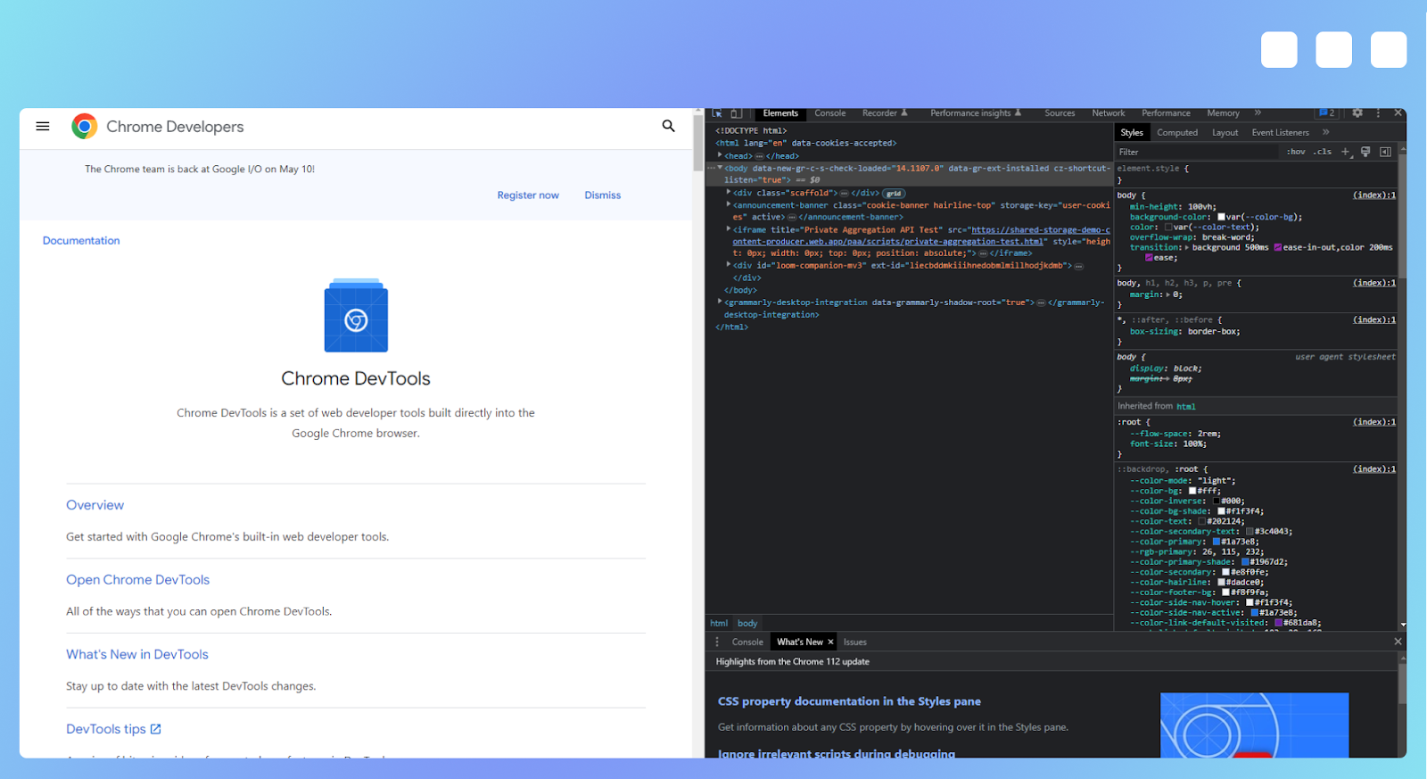
Chrome Developer Tools is a built-in feature within the Chrome browser that allows users to quickly and easily test the page they are browsing. While it supports a few mobile devices, it does not emulate them, instead allowing you to modify the viewport dimensions directly from your browser window. This tool is ideal for those looking for a simple way to assess their website's appearance and performance across different screen sizes.
Pros
- Readily available in Chrome: Chrome Developer Tools is built into the Chrome browser, making it easily accessible for anyone using this popular web browser.
- Extremely easy to use: With its user-friendly interface, Chrome Developer Tools is simple to navigate and utilize, even for those with limited technical expertise.
- Screenshot functionality: You can use Chrome Developer Tools to capture screenshots of your website at various viewport dimensions, allowing you to quickly evaluate its appearance on different devices.
Cons
- Limited devices available: Chrome Developer Tools only supports a few mobile devices, which may not be sufficient for thorough cross-device testing.
- Manual testing required: To assess each website page, you must manually navigate to and test them using Chrome Developer Tools. This can be time-consuming, especially for websites with many pages or complex navigational structures.
Best way to test your website on multiple screen sizes
To ensure your website loads as expected on any device, you must test it on multiple screen sizes. When choosing a tool for this task, you should consider the size and complexity of your website, as well as the number of pages and the resources you have available for testing.
By carefully evaluating your needs and the features offered by various tools, you can select the one that will provide the most comprehensive and efficient testing experience.
Try Urlbox today
Ready to improve your website's responsiveness and user experience? Give Urlbox a try! Sign up for a 7-day free trial with no credit card required and experience the benefits of this powerful screenshot service API for yourself.
